Unit 02 Explore materials, tools and techniques the support craft ideas:
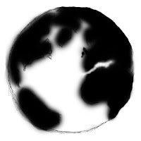 I have been experimenting on photo shop to find the perfect technique to use in my final design. These include using photo-manipulation and quick sketching on photo shop itself. Here is a quick sketch of the earth that I created on photo shop. This picture of the planet was my first initial experiment because I was practicing the paint tool method of drawing an image on CS5 Photoshop. I find this tool and method to be very effective in the way that it looks in the out come but a negative point I could say about this is that it takes a lot longer to produce than if I was just to REALLY edit a photo or if I was to use a shape tool in the making.
 I have been experimenting on photo shop to find the perfect technique to use in my final design. These include using photo-manipulation and quick sketching on photo shop itself. Here is a quick sketch of the earth that I created on photo shop. This picture of the planet was my first initial experiment because I was practicing the paint tool method of drawing an image on CS5 Photoshop. I find this tool and method to be very effective in the way that it looks in the out come but a negative point I could say about this is that it takes a lot longer to produce than if I was just to REALLY edit a photo or if I was to use a shape tool in the making.
~~~~~~~~~~~~~~~~~~~~~~~~~~~~~~~~~~~~~~~~~~~~~~~~~~~~~~~~~~~~~~~

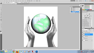
This is my initial idea. I like the idea of the two hands. As they symbolize 'everyone' in this world and that all cultures are equal and they all deserve the world as one. So this is why they are holding the earth. This is my favourite of the three ideas I produced and have been practicing and creating different versions of this image on photo shop. I'd only gotten to draw a final sketch of this image, the poster mock and my final design for this.
~~~~~~~~~~~~~~~~~~~~~~~~~~~~~~~~~~~~~~~~~~~~~~~~~~~~~~~~~~~~~~~
 20/09/2011. This is some experimenting that I've been working on on This image is one of few versions of this idea that I have tried to interpret via photo shop. I feel that this could do with maybe a little less as I believe in the good ol' sayin' ' Less is more ' .. Merely the fact that this looks like it maybe a little over-done. I used the magic wand tool to cut out of a clip-art image of the earth and used a 'Dollar-bill collage' to replace where it used to be. Then I used The burn tool, dodge tool and the paint tool to give the earth the 3D look. The earth and the hands where my initial idea but I thought that the hands and the earth alone looked a little .. lonely, so I added the hands coming from the clouds so that they weren't "just placed" in the middle of the screen. I think that what I did with the hands are really effective because it is really easy to tell that they are suppose to symbolize different cultures. I feel that maybe I should create the earth in this image maybe in the same style that I did with the arms.
Otherwise if everything in this image is in loads of different styles it could start to look messy and all over the place and the whole point of this image is to make the hands and the earth even and belong with each other but at the moment the hands look out of place.. or the earth looks out of place.
 This is a modification of my experiment. As a tip from Marnie.
I made the earth look more spherical. The other improvements I have made was the hand also. I got rid of all the white ares in the hand because it looked exactly like the first whit image just inverted. And the impression I wanted to give out was that the two hands where different people representing different races.
POSITIVE~ Positive points that i can say about this image, from my own opinion and opinions that I received in the group feed-back is that it is very visual and straight to the point. It says exactly what it is suppose to achieve which is what I was aiming to do in the first place.
I like out it is laid out. Because it is very simplistic. I also like the concept that everyone is entitled to the earth and that everyone deserves to be equal.
NEGATIVE~It is very dark and grim if the image was suppose to demand something positive I wanted to change it to make it less dark. The flames in this image also made the image look rather dark when the image is again suppose to be demanding something nice and positive and the flames just put the entire image out of place because it was dark and red and Flames always represents death or darkness. With this image too, the improvements I added that made my final piece where that I added at least some skin tone to the hands. Because in this image I don't feel that they where emphasized enough they seemed to be just black and white and the other hand was just inverted version of the white hand. Although this is a simplistic interpretation of different cultures I didn't feel that it was enough.
~~~~~~~~~~~~~~~~~~~~~~~~~~~~~~~~~~~~~~~~~~~~~~~~~~~~~~~~~~~~~~~
These are the source images that I used to create the above images on photo shop.The picture of the hands that you see where manipulated by tracing them with the brush tool. I then inverted a copy of the drawn image so that there was a negative of the image that I drew which you can see in the image representing a different colour. The two hand colours is a simplistic visual that is suppose to represent everyone in this world.
 I created the planet by making a collage of dollar-bills to look like a wall and then duplicated the layer and altered the Hue to make the dollar-bills look blue. I put the picture of the clip-art globe in a layer above it and selected all the green areas of the glob image and used that as a guide-line to erase the blue dollars that where in the green area. I then selected around the planet and did the same thing with the green dollar bills to get rid of the excess dollar-edges. This then created my dollar planet, but the image looked really flat so I used the burn tool and the dodge tool to add shade and reflection onto the planet to make it look like a sphere. I then found an image of two hands around a globe as a template image and used the paint tool to sketch the out line of the image and then did all the shading and the lighting myself as I explained I duplicated them and created a negative. I positioned the two drawn hands around the planet so it looked like they where some-what holding the (Dollar-bill)~earth. As I had a black back-ground because the image was a picture of a globe I felt that a black back-ground of the image was necessary to represent space. Because of this it looked very much like the hands holding the earth in the image where coming out of no where. So I found a picture of some orangy clouds and used just the corner of the image with light opacity so that they weren't a big part of the image and positioned one under the right hand. I then duplicated the image and horizontally flipped it so that there will be an exact reflection for the other hand. The text: I created the text and then made three copies of it. One in yellow, one in red and one in orange. I used the smudge tool on the red text to make some wisps at the top of the text to create a fiery look to it. Then I did the same to the yellow text but I used the eraser tool to erase the middle of the text to almost make the text look hollow, then making the wisps on the orange text also ordered the text so that the yellow was on top with the opacity slightly down, the orange in the middle and the red at the bottom I created the text to look like fire. One I'd merged the three texts I used the eraser tool on very low opacity to slightly erase the bottom of the text to almost give a gradient effect.
~~~~~~~~~~~~~~~~~~~~~~~~~~~~~~~~~~~~~~~~~~~~~~~~~~~~~~~~~~~~~~~
 This too I thought was a good idea. This was the idea I came up with when I followed a branch on my spider graph about money.
The image to the left was how I interpreted this image.
The ribbon wrapped around the earth in this image is money.
This is suppose to symbolize that everything in this world is about money, Controversy, poverty, unfair distributions and inside-corruption in the government.
I like this idea because I feel this image hits the nail on the head with the point in it and what it is suppose to symbolize. The reason i did not go with this idea is that I did not really feel that it was suppose to represent money and seemed a little TO simple.
~~~~~~~~~~~~~~~~~~~~~~~~~~~~~~~~~~~~~~~~~~~~~~~~~~~~~~~~~~~~~~~
 To be fair with this image I don't really like it very much. Never the less I am still going to try and work on this on maybe photo shop just so that I can get a visual on what this will really look like..
I don't really feel this image says peace. I feel that it just looks like something from a really scary movie.
Though I'm still going to try and get a real visual on this and see how it will really look and judge then if I feel that this is good enough to consider being part of my design. Maybe in the process this idea could adapt into being something a little better.
This is the experiment that I said above that I'll be working on. In my honest opinion I still stand by what I say of the idea. It doesn't really say 'I DEMAND' peace. It just looks like someone has played with a woman's
 eyes to make it look like from some scary vampire movie. But that is my opinion. I don't really have feed-back on this image because it was a quick experiment I whipped up after the presentation. I feel that maybe the peace symbol should instead of being her retinas, be a reflection in the eye.
I presented these ideas in a group of three and got back a lot of constructive feed-back.
I showed my initial ideas like my original sketches and such. I have yet to work on a final sketch and did not have that to show. But I showed them my first sketches and the ideas I have produced on photo shop with these sketches.
Feed-back.
Positive feed-back.
It is very visual.
Easy to figure out.
It is quite obvious that the hands are suppose to represent different cultures.
Negative ( constructive feed-back ).
Change the font to look more peaceful and to match the rest of the image.
The text looks to aggressive.
Enhance the hand to make them more visible and to stand out more.
Also to enhance the earth a little more to make it more visible because at the moment in the photo shop mock up it is a little bit too dark.
Tips.
Change the opacity in the money maybe.
Enhancing the earth.
Change the font to look less aggressive.
Enhance the hand so that it is more a part of the image rather than just the back-ground.
I showed my initial ideas like my original sketches and such. I have yet to work on a final sketch and did not have that to show. But I showed them my first sketches and the ideas I have produced on photo shop with these sketches.
~~~~~~~~~~~~~~~~~~~~~~~~~~~~~~~~~~~~~~~~~~~~~~~~~~~~~~~~~~~~~~~
Feed-back.
Positive feed-back.
It is very visual.
Easy to figure out.
It is quite obvious that the hands are suppose to represent different cultures.
Negative ( constructive feed-back ).
Change the font to look more peaceful and to match the rest of the image.
The text looks to aggressive.
Enhance the hand to make them more visible and to stand out more.
Also to enhance the earth a little more to make it more visible because at the moment in the photo shop mock up it is a little bit too dark.
Tips.
Change the opacity in the money maybe.
Enhancing the earth.
Change the font to look less aggressive.
Enhance the hand so that it is more a part of the image rather than just the back-ground.
~~~~~~~~~~~~~~~~~~~~~~~~~~~~~~~~~~~~~~~~~~~~~~~~~~~~~~~~~~~~~~~
19/09/2011Today we have been experimenting and practicing our skills on photo shop and learning the
 different tools. For example our first task was to take a picture of someone with no imperfections off of a search engine or something and basically create imperfections. For example freckles and blemishes/spots change the lighting on their face and such things.
I found a picture of the celebrity Angelina Jolie and changed such things like the shade in her face and gave her some bags under her eyes to make it more natural looking. I also brightened her hair in parts just to show her age a little more.
I also changed the contrast and it made a shiny effect on her face.. Like oily skin. In honesty it made her slightly more natural looking than the original image.
The way I did the blemishes and the faint freckles where with the paint tool but i turned the opacity way down so that these differences where still only slight. I did the bags under her eyes with the same technique and also used the burn tool to make the shading in her eyes to look slightly darker.
POSITIVE~ I'd say that the methods I used where really effective and it really does change her face to look more natural.
NEGATIVE~ I feel that I should maybe have made her skin tone a little more even so that her skin looks a little less patchy so that the image wasn't so obviously tampered with.
~~~~~~~~~~~~~~~~~~~~~~~~~~~~~~~~~~~~~~~~~~~~~~~~~~~~~~~~~~~~~~~
 After we did that task I carried on messing with the image and experimenting with tools and came up with a second image of Angelina Jolie. Essentially what I was aiming for this image to turn out to be was merely an elf. I learned surprisingly a lot while creating this image. I learned new techniques. Like instead of using paint to change the colour of an image for example..I used Hue. I learned that this technique is SOOO much easier too. I was having issues with the other way cause I found that the texture of the image was becoming very distorted. I also had some issues getting all of the hair copied so I edited a lot of it to get around it.
POSITIVE~ I like the concept that she is suppose to be an elf. The colour scheme works well. The image colours are limited to the greens and the purples.
NEGATIVE~ I think that maybe I should have cut her out of the first image and planted her in the second one a bit better. As I was met with some challenges to make her hair look more real. I think that also I have the same problem as I had in the first Joli image. As her skin in this image looks a little too bright on one side of the image and a little too dark in the other side of the image. So I could maybe improve that so that the light and the shadowing in this image isn't as emphasized as it actually is.
~~~~~~~~~~~~~~~~~~~~~~~~~~~~~~~~~~~~~~~~~~~~~~~~~~~~~~~~~~~~~~~
The second task that we did today was to find four images .. A back ground. And three objects to go into the image.
I chose a forest like scenery and edited a mini car into it. Also I edited a bird and a rabbit into the image. With this there where some difficulties. For example. Lee taught us the technique of using the select tool and the magic wand tool but the image I chose was almost the same colour as the back ground so I had to do it all pretty much with just the eraser tool. Also I had to somehow clone the image from the back ground and use it to create a reflection on the windows and the shiny surface of the car. After using these techniques yesterday. I find that knowing how to use them makes it easier to become more fluent with them. After about half an hour of experimenting and discovering new tools. I felt that I could find them easy to use for the future. I myself am actually proud with how the image turned out because in a sense it looks almost magical. Improvements that I could make is to maybe enhance the car in some way and maybe make the rabbit more real as it looks rather large. Even though it is suppose to look closer I feel that I should have worked more with editing the shading and the reflection.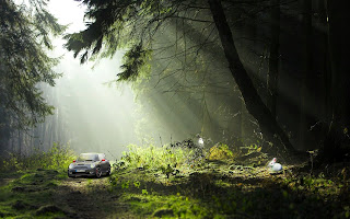
I chose a forest like scenery and edited a mini car into it. Also I edited a bird and a rabbit into the image. With this there where some difficulties. For example. Lee taught us the technique of using the select tool and the magic wand tool but the image I chose was almost the same colour as the back ground so I had to do it all pretty much with just the eraser tool. Also I had to somehow clone the image from the back ground and use it to create a reflection on the windows and the shiny surface of the car. After using these techniques yesterday. I find that knowing how to use them makes it easier to become more fluent with them. After about half an hour of experimenting and discovering new tools. I felt that I could find them easy to use for the future. I myself am actually proud with how the image turned out because in a sense it looks almost magical. Improvements that I could make is to maybe enhance the car in some way and maybe make the rabbit more real as it looks rather large. Even though it is suppose to look closer I feel that I should have worked more with editing the shading and the reflection.

POSITIVE~ I like this image as it is very subtle. It isn't obvious that that car doesn't really belong in this image. Also the bird and the rabbit are in this image quite subtly too.
I like that i added some whit specks in the light rays just to give this image the impression that there is a little bit more light than the eye can really see. I also did this by adding a glow around the bird and the rabbit and some reflection on the sides and the windows of the car.
NEGATIVE~ I think that maybe I should have made the car in the image a little lighter so that it is more noticeable or visible. Also I feel that the right side of the wind-screen on the car should have maybe had some more reflection or light because you can see the steering wheel in the image. which isn't a bad thing it's just that this image seems that half of its been erased or something and that is not the impression I want this image to give. I want it to look like the car is part of the whole image.
~~~~~~~~~~~~~~~~~~~~~~~~~~~~~~~~~~~~~~~~~~~~~~~~~~~~~~~~~~~~~~~
21/09/2011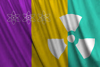

This morning we where showed how to create a flag by texturing a block image.
Firstly we created a colour scheme with the rectangular marquee tool and marked out three colours. Mine is Purple, Yellow and teal. I then used the 'Custom shape tool' to make the Bio-hazard shapes on my flag. I then merged all the layers. I opened a new file and was given a link by our tutor.
This is very useful if I feel that any of my work needs to be textured.
http://www.unsigneddesign.com/fabric4_edited.jpg
 neddesign.com/fabric4_edited.jpg
This is the image of the fabric that we used to create the texture of the image.
We made this image Black and White (gray scale).
We saved this image in photo shop format.
Going back to the image with the colour scheme we made it fit the image of the fabric by clicking:
Filter -> Distort -> displace.
 The image on the left is before the image displacement and the image on the right is after.
~~~~~~~~~~~~~~~~~~~~~~~~~~~~~~~~~~~~~~~~~~~~~~~~~~~~~~~~~~~~~~~
 Firstly I chose a custom shape that is like a block shape. And clicked the path tool.
I then opened the text tool and as I scrolled over the path of the shape the text tool automatically changed its route so that it will follow the shape.
This is where you s
 elect the path tool. This is so that the text
will follow the shape and will not type as if it would do in a normal text box.

 This is more experimentation we did with text. We used the text warp tool to make it the shape that it is..
After this we pressed command button and clicked on the little icon image on the text layer to select the text. Then hid the text layer so that all you could see was the selection on a white screen. Then using the paint brush tool I painted in the selection as the selection would make sure that it would not go further than the lines of the edge of the text. This is where I chose a number of colours to create the text you see on the left that reads " Lololololo ".
This is more typography work that we have completed.
This image that I created on the web-site is hyper-linked to the wordle tool that I used. After you enter this web-site you click ' Create' and then type the words that come into your mind. There is an automatic program that will create this text for you and there is an option to change the design.
~~~~~~~~~~~~~~~~~~~~~~~~~~~~~~~~~~~~~~~~~~~~~~~~~~~~~~~~~~~~~~~
23/09/2011

I spent today practicing on my photography and using these photos on photo shop to practice photo manipulation.
I created two panoramic photos put of the ones that I took using the photo-merge tool.
I knew already how to photo-merge. But I got some information from a web-site because it explains in better detail on how.
Applying Cylindrical Mapping
Following the instructions above that I got from http://help.adobe.com/en_ US/photoshop/cs/using/WSfd1234e1c4b69f30ea53e41001031ab64-75e8a.html
The images below where the results that I got.
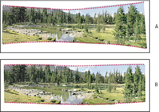
POSITIVE~ Both of the images where very well stitched and there is no mistake with the stitching that I can see.
NEGATIVE~The image of the pavement was merely an experiment so there is not much good that I can really say about it. Panoramic photos are normally three photos stitched from the center image the left and the right one must but no less than forty degrees. I feel that this is the only thing I should have taken note. This isn't a mandatory thing but it will help with the stitching. In the image of the pavement I did not take three photos. I took five in the hope that they will stitch correctly. This isn't the wrong way to do it or the right way to do it. But it was the way that I was taught in photography and feel that this is the way that I should have followed. But as I did not have a tripod that day it would ha ve been harder to do it the correct way.
26/09/2011
Today we are starting on our final pieces.
I saved my last work that I did as a JPEG so I was met with some difficulties copying some layers from my last design. So I used the lasso tool and copying the image of the hand. The image to the left is the i mage that I used and how I selected the image that I'd previously drawn.
Using the eraser tool I erased all the edges of the image so I wasn't l eft with the rough cut out look from the other image. After I did so I duplicated the layer and selected Edit > Transform > Flip horizontal.
This gives me an identical version of my original hand. This I can use as th e other hand. In the image to the left I hadn't actually placed the other hand yet.
 After I'd repositioned the hand and put the layer with the planet image on view the image looked like this.
<<<
The hand to the right is in the beginning of another process. I had to erase everything in the center of the hand so that it was left with just an out-line. This was because it was an exact copy of the other one just flipped. And the shading and the highlights where all in the wrong place and the image would not have looked right at all. So once I erased all of the shading in the other hand, being careful of the out-line. I added new shade and reflection.. But as if the shade was to the right and the highlights where to the left. I also lig htened some of the shade on the left hand because there was a dark patch on the left side of the hand and that was where the light was actually coming from.
After I changed the shade on the hands using the eraser tool, pa int tool an d the dodge and burn tools I added some skin tone to the right hand. Using the paint tool I selected colourize ( colour) and shaded in the hand. I used the dodge tool to add the highlights to the hand afterward and used the burn tool to edit the shading some more. I did the same with the hand on the rig ht. To add the highlights though I tried to use the dodge tool and it wasn't working out too well. The colour i used to create the hands skin-tone turned red. So I used the eraser tool on a very low opacity to create all of the highlights. On this image you see that a lot more has also been done to it. I created a sky-blue back ground and added a glow around the image of the planet and the hands. This was to emphasize them more and to make them stand out a lot more.
POSITIVE~ The image after all of the improvements looks more lighter and less agressive. The hands now have some form of tone to them so they are more recognizable as hands.
The text fits the shape of the globe so it isn't some invasive text that is covering anything or isn't over-lapping anything.
NEGATIVE~ I could have worked more with the glow to make it look more emphasized. I could possibly change the blue to a more purpley blue. Just to give it a more warmer look.
I need to work on the hands a little more because it doesn't look like the light in the image is actually coming from a specific direction.
[I've hyper-linked the image below to the source website that I got this information from.]
1. Create a new document and use the "Text" tool (T) to create a line of text.
2. Apply a "Polar Coordinates" filter. When warns that the text will be rasterized, click OK.
3. In the "Polar coordinates" dialog, select "Rectangular to Polar" and click OK.
4. Your text is now curved but isn't proportional.
5. Use the "Transform" tool (Ctrl+T) to increase the height12/09/11
I researched 4 digital artists and a piece of each of there work.
Then I analyzed their work describing the good points the bad points what I think could have been done better what I think is fine the way it is. I also wrote about their techniques, colour use, composition and what effect the specific piece has on me myself.
13/09/11
I produced my ideas and concepts and my sketches.
I used spider-graphs to produce my ideas and drew up three sketches following three of the branches from my spider-graphs.
14/09/11
We presented these idea and mock ups of the idea that we had so far and documented the feed-back we received about our work. We also gave feed-back about other peoples work. And shared input with-in a group of around three.
14/09/11-20/09/11
I have been creating mock ups and experimenting on photoshop using many tools and learning about the different ways they could work. Creating lots of different little projects to help us with this one.
21/09/11-27/09/11
In this time I have been creating my final design, putting my ideas on screen and producing them via CS5 Adobe Photoshop.
27-09-11
I created two panoramic photos put of the ones that I took using the photo-merge tool.
I knew already how to photo-merge. But I got some information from a web-site because it explains in better detail on how.
~~~~~~~~~~~~~~~~~~~~~~~~~~~~~~~~~~~~~~~~~~~~~~~~~~~~~~~~~~~~~~~
Take pictures for Photo-merge
Your source photographs play a large role in panoramic compositions. To avoid problems, follow these guidelines when taking pictures for use with Photo-merge:
- Overlap images sufficiently
- Images should overlap by approximately 40%. If the overlap is less, Photo-merge may not be able to automatically assemble the panorama. However, keep in mind that the images shouldn’t overlap too much. If images overlap by 70% or more, Photo-merge may not be able to blend the images. Try to keep the individual photos at least somewhat distinct from each other.
- Use one focal length
- If you use a zoom lens, don’t change the focal length (zoom in or out) while taking your pictures.
- Keep the camera level
- Although Photo-merge can process slight rotation s between pictures, a tilt of more than a few degrees can result in errors when the panorama is assembled. Using a tripod with a rotating head helps maintain camera alignment and viewpoint.
- Stay in the same position
- Try not to change your position as you take a series of photographs, so that the pictures are from the same viewpoint. Using the optical viewfinder with the camera held close to the eye helps keep the viewpoint consistent. Or try using a tripod to keep the camera in the same place.
- Avoid using distortion lenses
- Distortion lenses can interfere with Photo-merge. However, the Auto option adjusts for images taken with fish-eye lenses.
- Maintain the same exposure
- Avoid using the flash in some pictures and not in ot hers. The blending features in Photo-merge helps smooth out different exposures, but ext reme differences make alignment difficult. Some digital cameras change exposure settings automatically as you take pictures, so you may need to check your camera settings to be sure that all the images have the same exposure.
Create a Photo-merge composition

Applying Cylindrical Mapping
- A.
- Original
- B.
- Cylindrical Mapping applied
- Spherical
- Aligns and transforms the images as if they were for mapping the inside of a sphere. If you have taken a set of images that cover 360 degrees , use this for 360 degree panoramas. You might also use Spherical to produce nice panoramic results with other file sets.
- Collage
- Aligns the layers and matches overlapping content and transforms (rotate or scale) any of the source layers.
- Reposition
- Aligns the layers and matches overlapping content, but do es not transform (stretch or skew) any of the source layers.
- Blend Images Together
- Finds the optimal b orders between the images and create seams based on those borders, and to color match the images. With Blend Images Together turned off, a simple rectangular blend is performed. This may be preferable if yo u intend to retouch the blending masks by hand.
- Vignette Removal
- Removes and performs exposure compensation i n images that have darkened edges caused by lens flaws or improper lens shading.
- Geometric Distortion Correction
- Compensates for barrel, pincushion, or fish-eye distortion.
~~~~~~~~~~~~~~~~~~~~~~~~~~~~~~~~~~~~~~~~~~~~~~~~~~~~~~~~~~~~~~~
Following the instructions above that I got from http://help.adobe.com/en_ US/photoshop/cs/using/WSfd1234e1c4b69f30ea53e41001031ab64-75e8a.html
The images below where the results that I got.


NEGATIVE~The image of the pavement was merely an experiment so there is not much good that I can really say about it. Panoramic photos are normally three photos stitched from the center image the left and the right one must but no less than forty degrees. I feel that this is the only thing I should have taken note. This isn't a mandatory thing but it will help with the stitching. In the image of the pavement I did not take three photos. I took five in the hope that they will stitch correctly. This isn't the wrong way to do it or the right way to do it. But it was the way that I was taught in photography and feel that this is the way that I should have followed. But as I did not have a tripod that day it would ha ve been harder to do it the correct way.
~~~~~~~~~~~~~~~~~~~~~~~~~~~~~~~~~~~~~~~~~~~~~~~~~~~~~~~~~~~~~~~
26/09/2011

I saved my last work that I did as a JPEG so I was met with some difficulties copying some layers from my last design. So I used the lasso tool and copying the image of the hand. The image to the left is the i mage that I used and how I selected the image that I'd previously drawn.

This gives me an identical version of my original hand. This I can use as th e other hand. In the image to the left I hadn't actually placed the other hand yet.
 After I'd repositioned the hand and put the layer with the planet image on view the image looked like this.
<<<
The hand to the right is in the beginning of another process. I had to erase everything in the center of the hand so that it was left with just an out-line. This was because it was an exact copy of the other one just flipped. And the shading and the highlights where all in the wrong place and the image would not have looked right at all. So once I erased all of the shading in the other hand, being careful of the out-line. I added new shade and reflection.. But as if the shade was to the right and the highlights where to the left. I also lig htened some of the shade on the left hand because there was a dark patch on the left side of the hand and that was where the light was actually coming from.

POSITIVE~ The image after all of the improvements looks more lighter and less agressive. The hands now have some form of tone to them so they are more recognizable as hands.
The text fits the shape of the globe so it isn't some invasive text that is covering anything or isn't over-lapping anything.
NEGATIVE~ I could have worked more with the glow to make it look more emphasized. I could possibly change the blue to a more purpley blue. Just to give it a more warmer look.
I need to work on the hands a little more because it doesn't look like the light in the image is actually coming from a specific direction.
~~~~~~~~~~~~~~~~~~~~~~~~~~~~~~~~~~~~~~~~~~~~~~~~~~~~~~~~~~~~~~~
[I've hyper-linked the image below to the source website that I got this information from.]
2. Apply a "Polar Coordinates" filter. When warns that the text will be rasterized, click OK.
3. In the "Polar coordinates" dialog, select "Rectangular to Polar" and click OK.
4. Your text is now curved but isn't proportional.
5. Use the "Transform" tool (Ctrl+T) to increase the height12/09/11


I researched 4 digital artists and a piece of each of there work.
Then I analyzed their work describing the good points the bad points what I think could have been done better what I think is fine the way it is. I also wrote about their techniques, colour use, composition and what effect the specific piece has on me myself.
13/09/11
I produced my ideas and concepts and my sketches.
I used spider-graphs to produce my ideas and drew up three sketches following three of the branches from my spider-graphs.
14/09/11
We presented these idea and mock ups of the idea that we had so far and documented the feed-back we received about our work. We also gave feed-back about other peoples work. And shared input with-in a group of around three.
14/09/11-20/09/11
I have been creating mock ups and experimenting on photoshop using many tools and learning about the different ways they could work. Creating lots of different little projects to help us with this one.
21/09/11-27/09/11
In this time I have been creating my final design, putting my ideas on screen and producing them via CS5 Adobe Photoshop.
27-09-11
No comments:
Post a Comment